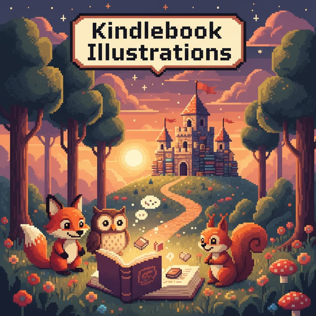
Character Design Mastery: 20 Essential Tips for Creating Iconic Illustrations
In the world of illustration, strong character design doesn't always require complexity. Some of the most recognizable characters in history, from The Simpsons to Charlie Brown, are built on simple yet powerful design principles. Discover how to create characters that leap off the page and into readers' hearts with these 20 tips.

Introduction: The Power of Simple Character Design
In the world of illustration, strong design doesn't always have to be complex or difficult. In fact, some of the most famous illustrated characters are based on simple but powerful design principles. Just think of The Simpsons or Charlie Brown: both deceptively straightforward characters, yet instantly recognizable and iconic.
However, oftentimes, it's not so straightforward as it would seem to strike the golden combo of simplicity and clarity. This guide walks through practical tips for character design with plenty of examples to illustrate, of course.
🎨 Want to design iconic characters? Follow these 20 tips for simple yet memorable character designs.
Center the Storytelling
Illustration is, at its core, a storytelling medium that helps readers and viewers get to know a character beyond their appearance. Centering the story before even starting to think about the visuals lays a strong foundation and adds depth to your character design.
But "centering the story" sounds pretty abstract, so let's break it down a bit further.
1. Give Your Character a Backstory
A first step to center storytelling is to start thinking about backstory. You don't have to go as in-depth as an author might, but having an idea about who the character is and what they do can help spark imagination and draw something that captures attention.
For example, when trying to develop a unique silhouette or exaggerate a particular feature (something we'll talk more about later), knowing a character's backstory can inform everything from their attire to their posture.
💡 Pro Tip: Make sure that the character's outward appearances match their narrative arc so there's no distracting dissonance between the two!
If working with a client who already knows the backstory of the character, like an author, you can ask them directly for the information needed to proceed. This way you can make sure that the character's hair is actually flaming red or that they're holding an archery bow, like they asked. But if that's not an option, investing some time in coming up with a rough profile of those characters will help create a more coherent and consistent design, and will be worth it in the long-run.
2. Remember Who the Target Audience Is
Much like authors, you need to have a good idea of who your target audience is to make sure you're speaking a pictographic language the audience will understand.
Ideally, the whole world will enjoy the work, but realistically, the audience will be more narrow, so creating a hypothetical ideal audience member can help make better design choices. Put yourself in the audience's shoes and consider what other references they have before coming to the work and what they expect to see in the type of story being conveyed.
Helpful questions to determine target audience:
- What is your target audience demographics? A niece might like one type of character, while an uncle will likely prefer something else entirely.
- What previous references and experiences does your target audience have? Are they an experienced Manga reader, a Classic Arts major, or a complete beginner to visual storytelling?
- What genre or type of illustration are you doing? Superhero graphic novels, slice-of-life manhwas, and whimsical picture books come with different stylistic and thematic conventions which the audience will expect you to either comply with or challenge, but at the very least acknowledge.
One can't custom design a character for every type of reader. But asking these questions starts a thought process that informs the design. This shapes how readers interpret, resonate, and enjoy the work.
3. Focus on Communicating One Message
Lastly, when it comes to centering storytelling, ask yourself what lasting impression you want your design to leave. What is the primary message, the larger story, you want the character to convey? Is it empathy, sadness, fierceness, or anger, for instance? Good vs. evil? Political satire?
You have different tools than authors: authors can go into detail and explain any uncertainties or contradictions with words, but you don't have that luxury. Instead, you're much better served by focusing on one central aspect you want your design to communicate, and make that as clear as possible by removing or toning down any distracting or conflicting elements that might muddle the message.
Gather Reference Material
Once there's an idea of the foundation of the character, it's time to do some research and preparation. Gathering reference material will not only inspire, but help illustrators continually grow and improve their craft.
Here are some favorite ways to gather references:
4. Browse Through Pinterest and Portfolios
The good thing about the digital age we're living in is that one can also gather inspiration from real life or other creators without leaving the house. Whether creating mood boards, pinning favorite pictures, or searching for inspiration, Pinterest and other galleries like Artstation are a great place to start.
One may just be searching for an elusive "vibe" or a certain art style, or be looking for specific advice on body proportion and how to draw movement, but online image searches and browsing through illustration portfolios are sure to yield some interesting results pretty instantly. Just be prepared to sort through some duds before striking gold (and once you do, bookmark them for later projects).
Make Sure the Silhouette Stands Out
The silhouette of a character shapes how readers recognize them. This is the outline or shape which is left when removing everything else, and getting it right will lay the foundation for the character.
Most famous characters have distinct silhouettes that make it possible to recognize them in any context, even if altering the original style of illustration.
Let's look a bit closer at what can be done to create a unique silhouette.
5. Employ Consistent Shape Language
Nailing the silhouette means being conscious and intentional about the shape language (also known as shape motif) used.
According to art theory, different shapes subconsciously communicate different messages to the viewer. At the most basic level, squares can indicate values such as trust, stability, or even stubbornness; circles might indicate that someone is friendly, bouncy, soft, or happy; and triangles can suggest things like edginess, danger, intensity, or speed.
Well-known examples:
- Square: Spongebob, a literal square, belongs to the comforting and clumsy category.
- Circle: Winnie the Pooh consistently sticks to the circle motif, with his round belly, ears, and paws. Even when props are added, they tend to stay in the round realm, like a balloon or a honey pot.
- Triangle: Sonic the Hedgehog, with his spiky hair, is a clear example of how triangle shapes are used to visually represent speed. The illustrator uses this shape language on the ears and the points of his shoes as well to create congruence.
While it's generally good to avoid conflicting messages, sometimes combining shape motifs makes sense. So long as it's done with intention and remembering to keep one shape as the focal point. This helps the viewer instinctively pick out the central message, even if there are sub-messages too.
6. Add a Unique Element
If feeling like everything possible has been done to sharpen the silhouette but it's still missing something to set it apart from the rest, a simple trick to use is to add a characteristic element. This might be anything from a hairstyle (like Sonic), to clothing (like Donald Duck's sailor shirt and cap), to a weapon (like Captain Hook's hook and cutlass sword).
7. Make Each Character Unique, Yet Consistent
If designing more than one character for a project, one wants them to be both different from each other so that they can be told apart, and consistent enough that they make sense together. This is primarily achieved by maintaining the same style for the whole cast, but that's easier said than done.
To make sure that characters don't become too same-y or, on the contrary, feel like characters that don't belong on the same page, control whether there's a firm understanding of the overall story and of the world it is set in. Additionally, remember to frequently place characters side by side throughout the illustration process, preferably on the same sheet, to see how they play off each other.
8. Compare Multiple Characters by Using Lineups
In a lineup, place characters next to each other on a baseline to compare their dimensions, just like suspects are lined up in front of a witness.
In illustration, this helps to reveal whether characters are too similar or too different from each other: if all characters are the same height and build, for instance, the overall illustration becomes stale and the audience will have a harder time distinguishing between characters; if all characters are based on the same shape language, say, only having round, circular characters, it might be an indication that variation is missing in the cast.
Essentially, comparing characters will help make sure that the design remains dynamic and that one doesn't inadvertently draw the same character over and over again.
Character Design Examples


Notice how each character has a distinct silhouette and unique characteristics while maintaining visual consistency.
Be Selective with Your Color Palette
A carefully curated color palette, i.e., having fewer colors on the palette, can help create clarity and set one up for success. But how does one know what colors to use and how to combine them?
Well, color, much like silhouette, is about breaking it down to the essentials.
Here are a few things to consider when choosing a color palette:
9. Consider Color Language
Just like the silhouette should be based on the basic principles of shape language, one can pick the color palette by considering the language and emotions associated with certain colors. The issue is that color language is a bit more complex than shape language.
Yellow may signify joy and happiness, green trust and stability, and red danger. But yellow can also mean sickly, green can mean rotten or poisonous, and red can mean love. Colors might also have different meanings depending on the culture and context, like how red is a lucky color in China while white is the color of mourning, as opposed to black in many Western cultures.
Getting familiar with some color theory and picking colors carefully is a good habit to cultivate and helps make characters pop. But with infinite options on the color wheel, not to mention the ability to play around with contrast and color values, one should probably approach color language more as a guideline than a hard and fast rule. The good news is that this leaves lots of room to experiment.
10. Use Colors to Represent Elements
One way to use color is to indicate what type of environment a character is from, or whether they have any particular ability to manipulate the elements. One can, for instance, use blue to suggest that a character comes from a cold place, or has the ability to control water or air, while green might mean they may come from a verdant place, or are able to manipulate mother earth.
Using colors this way can help tell a story by honing in on a particular characteristic and highlighting it. This signals to the reader what type of character they're seeing and how they're supposed to feel about them.
11. Create a Color Hierarchy
For designers and illustrators, visual hierarchy is part of the bread and butter; that is, arranging the elements of the design so that one guides the viewer's eyes towards the focal point. Color choice and establishing an internal hierarchy amongst colors can be one way of doing this. But what does that mean?
Well, we've already said that one should be selective with colors and avoid adding too many to the same design. Then, amongst the colors chosen, one might want to pick one dominant color that is used on the focal point of the design. The other colors on the palette should support this color, not compete with it, to avoid making the palette too crowded.
In Sonic the Hedgehog, for example, the dominant color is clearly blue while the supporting colors are white, beige, red, neon green and black. None of these colors compete with blue for attention, but still add detail to the design.
12. Pay Attention to How You Combine Colors
To help select colors for the palette, it's also useful to consider what and how to combine colors well. Here are three types of situations to look out for:
- Colors vying for attention: A competing color may just be a color that is trying to one-up the dominant color in the color hierarchy established. Using two strong colors in equal measures can draw attention away from the thing intended to be highlighted.
- Colors that are too similar: Colors that are similar to each other start to blend together, and sometimes it can make the different parts of the character design less distinct. One way to discover this is to remove the line art to see if one can still clearly separate one element of the design from the other, the way intended.
- Contrasting/complementary colors: 'Contrasting' or 'complementary colors, i.e., colors that are on the complete opposite side of each other on the color wheel, run the risk of pulling the audience's attention in too many directions at once. On the other hand, there's no risk of blending elements together, so use them with purpose and intention.
13. Check Your Character Palette Against Various Backgrounds
Lastly, no matter how carefully one chooses the colors for the character design, remember to always check it against the background(s) the characters will be placed on. All work will be in vain if it clashes or blends too well with the background.
With all that said, let's take a moment to acknowledge that color theory is complex and that there are no hard and fast rules. In the end, one decides what to highlight and how to apply colors, but if letting 'clarity' and 'simplicity' of message be the guiding principles, one is more likely to step on the right path.
Exaggerate Your Observations of Reality
As an artist, regardless of what medium one works in, one of the ultimate goals is probably to capture and reinterpret reality so that other people can see it through a new lens; telling a story about the world as one sees it, with the hopes that it will resonate with other people too.
Of course, how to capture reality and communicate something that rings true is one of the biggest questions in all of art, and probably not one we'll be able to answer in this article, but exaggerating one or two elements that capture something observed is a good place to start.
14. Strip It Down to the Essentials
The first thing to do with the design is to strip it down to the essentials. What is the main message of the story that one wants to communicate, what is the main quality one wants the character to represent, what is the overwhelming feeling one wants the viewer to get when they look at the design, and what are the silhouettes, colors, and proportions one can use to achieve this? And, most importantly, how do these things help capture the world observed?
If having these answers, a lot of decisions made later in the process will feel obvious, and not really like decisions at all, but instinct.
15. Hone In on a Few Details
Having established the essentials, it's time to pick a few details that can represent the message in visual form. Say one wants to communicate trust and stability, then drill down on the square shape motif and make it extra obvious with a non-threatening color palette. Or perhaps one wants to draw a relatable and clumsy character, so give them two left feet, literally.
No matter what one does, focusing on a few details is better than trying to do it all at once. This makes it easier for the audience to decode the message and enjoy the storytelling. And from a creative process point of view, it's much easier to work with a clear goal in sight than if pulled in too many directions.
🦄 Pro Tip: Good character design is reliant on quickly communicating a message, but that also makes it easy to revert to cliches and stereotypes. There are countless villains wearing dark capes, and more than enough alluring vixens who all look the same out there, so when deciding on a detail to highlight, think about how to put one's own spin on it, or how to subvert conventions and expectations as one goes.
16. Play Around with Proportions and Dimensions to Direct Attention
In addition to working on the main components of the silhouette (head, torso, limbs), one can also hone in on details such as attire, facial features, or props to create a unique and cool character design.
Who can't help but fall in love with a dog whose ears are so long they keep stepping on them, or laugh at the evil antagonist who is too small to wield their weapon properly? Playing around with the proportions in this way can make the character memorable, and create more variety in a larger cast.
17. Capture Emotions with Clear Facial Features
As far as details go, facial features are often a great way to get a point across and communicate emotions, but also tricky to get right. A frown, a goofy smile, or an evil grin have vastly different effects, and can elevate the design to new heights, when applied appropriately.
No matter how elaborate the costume or epic the weapon is, characters can feel pretty flat and devoid of personality if not paying the same attention to their facial features. This is often where the real emotion shines through, so a small flick of the brush can have a big impact on the final outcome.
18. Use Poses to Convey Characteristics
With that said, facial features are not the only way to express emotion or personality. In fact, one will achieve the best effect if managing to combine it with body language. A character may grit their teeth however much they want, but if they're just standing up straight as a stick, the audience is unlikely to interpret it as frustration. And sass is always best expressed with one hand on the hip and an eye roll, wouldn't you say?
Poses and body language can express anything from typical ideas of femininity and masculinity, to sadness, pensiveness, or confidence.
Character Illustrations in Action
.png&w=3840&q=75)
.png&w=3840&q=75)
See how characters can be placed in different scenes and poses while maintaining their distinctive design.
Get Feedback and Continue to Improve
If having used the tips and tricks in this article and applied some unique flavor to the character, it's time to ask for feedback before it'll be ready to be published.
19. Ask Peers and Clients for Feedback
Many illustrators work on a freelance basis and, if working from home, it can be pretty isolating. That's why building a network of other professionals in the industry who one trusts to give honest and constructive feedback helps. If having trouble with a design but not quite sure why, sometimes one just needs a fresh pair of eyes, so don't be afraid to ask for help and remember to be open to the feedback received. Being a member of industry organisations, like SCBWI, is a great way to make connections with fellow designers who may be willing to share insight.
And if working with a client, it'll be the job to decide how to incorporate their feedback, when to trust instinct as a designer, and how to communicate the design to a non-designer. Ultimately, making sure that the client is happy with the work matters, so trust and good communication make all the difference.
20. Revise and Refine Your Character Design to Perfection
With feedback in hand, it's time to head back to the drawing board and make revisions or final tweaks. Once happy with the final result, the character should be ready to leap off the page and into people's hearts.
Conclusion: Bringing Your Characters to Life
Creating iconic character designs is both an art and a science. By centering storytelling, gathering the right references, perfecting silhouettes, selecting thoughtful color palettes, and exaggerating specific details, illustrators can create characters that readers remember long after closing the book.
The most memorable characters come from simple but powerful design principles. Whether working on a children's book, graphic novel, or any other illustrated project, these 20 tips provide a solid foundation for creating characters that readers will remember long after they've closed the book.
The journey of character design is one of continuous learning and refinement. Don't be afraid to experiment, seek feedback, and iterate on designs. With practice and these principles in mind, any illustrator can create characters that capture hearts and imaginations.

.png&w=3840&q=75)